The Whitman Roberson Team is led by Tyler Whitman and Ashlie Roberson, two seasoned brokers bringing both warmth and precision to the NYC market. With a smart, data-driven approach wrapped in Southern charm, they’ve built a business on trust, tenacity, and treating clients like family. To celebrate Ashlie’s ascension to partner and officially enter the market as a unit, they came to our team to lead their rebrand.
Brand Strategy
Brand Identity
Visual Identity System
Logo
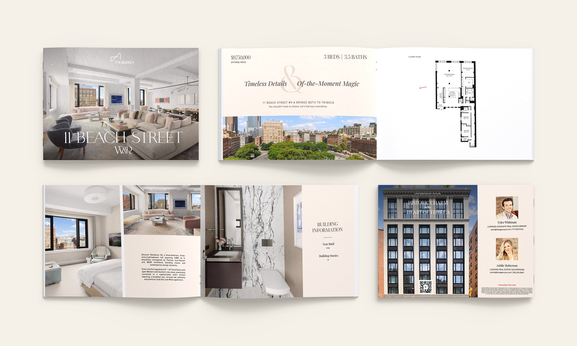
Custom Brochure
Custom Newsletter
Facebook & LinkedIn Banners
Listing eBlast
Listing Sheet
Moodboards
Social Media Templates


After multiple conversations, it was clear Tyler and Ashlie had a strong sense of identity. They’d spent years building a distinct tone and clear values, and stressed how important it was to keep those front and center. Once our brand strategist/copywriter defined their brand foundation, we focused on refining their essence and translating it into a unified system they could grow with. The final identity needed to feel elevated but approachable, with a tone that matched their sharp instincts and best-friend energy.
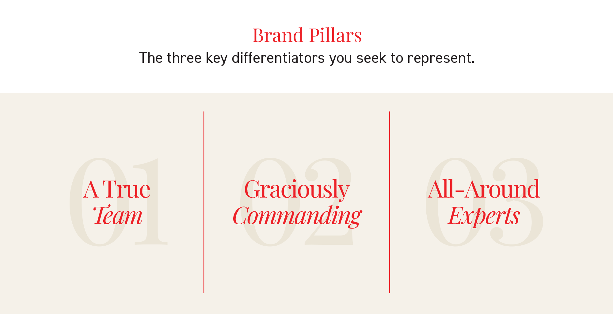
We explored two directions, each interpreting the team’s personality from a different angle. “Bringing Both” leaned into contrast as a strength, utilizing an ampersand as both a graphic motif and narrative hook. “Fueled by Fun” took a lighter approach, using angled typography and energetic language to echo their charisma. Both concepts built on the team’s existing visual foundation, giving us space to push the brand into something more cohesive.

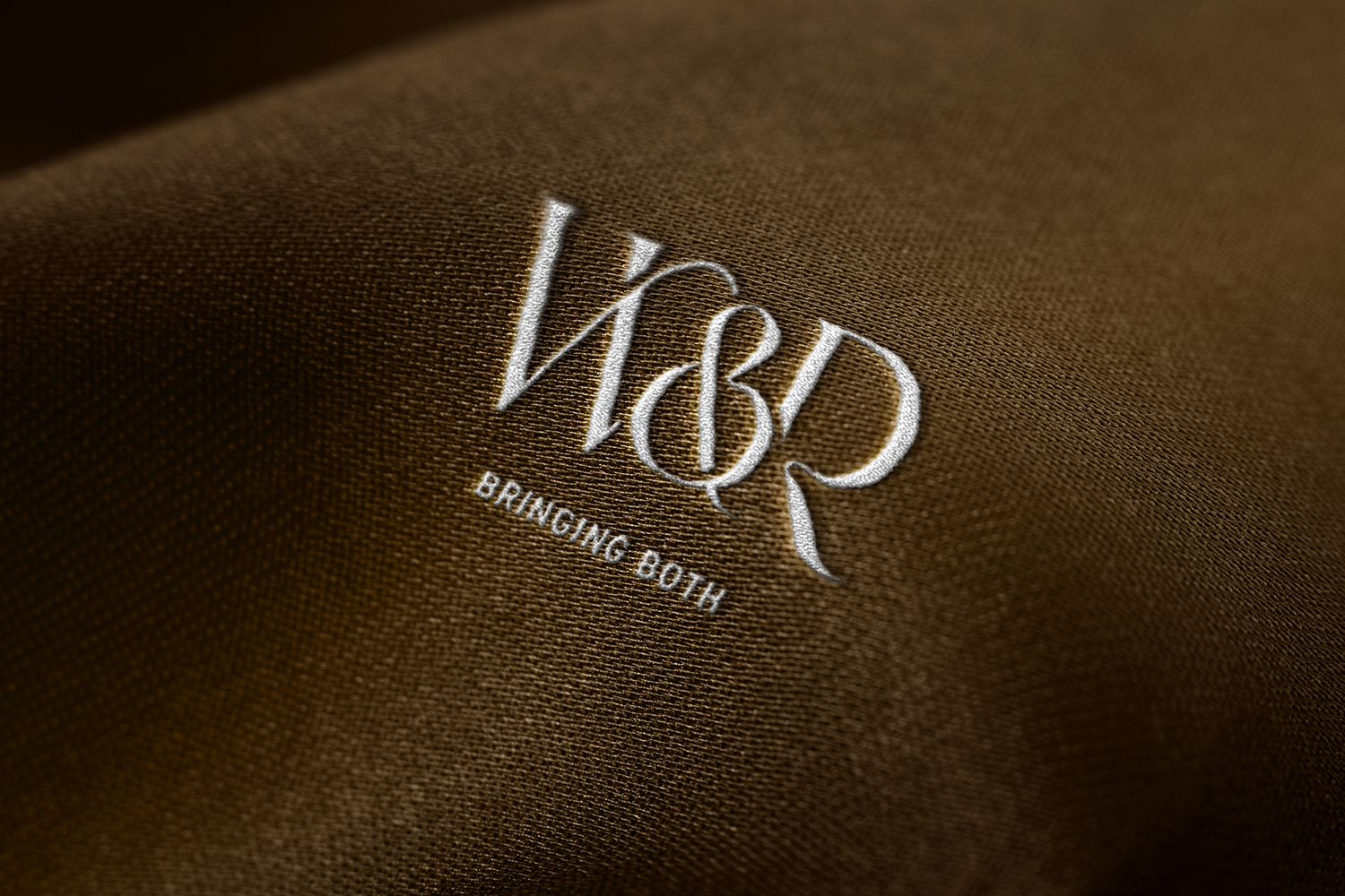
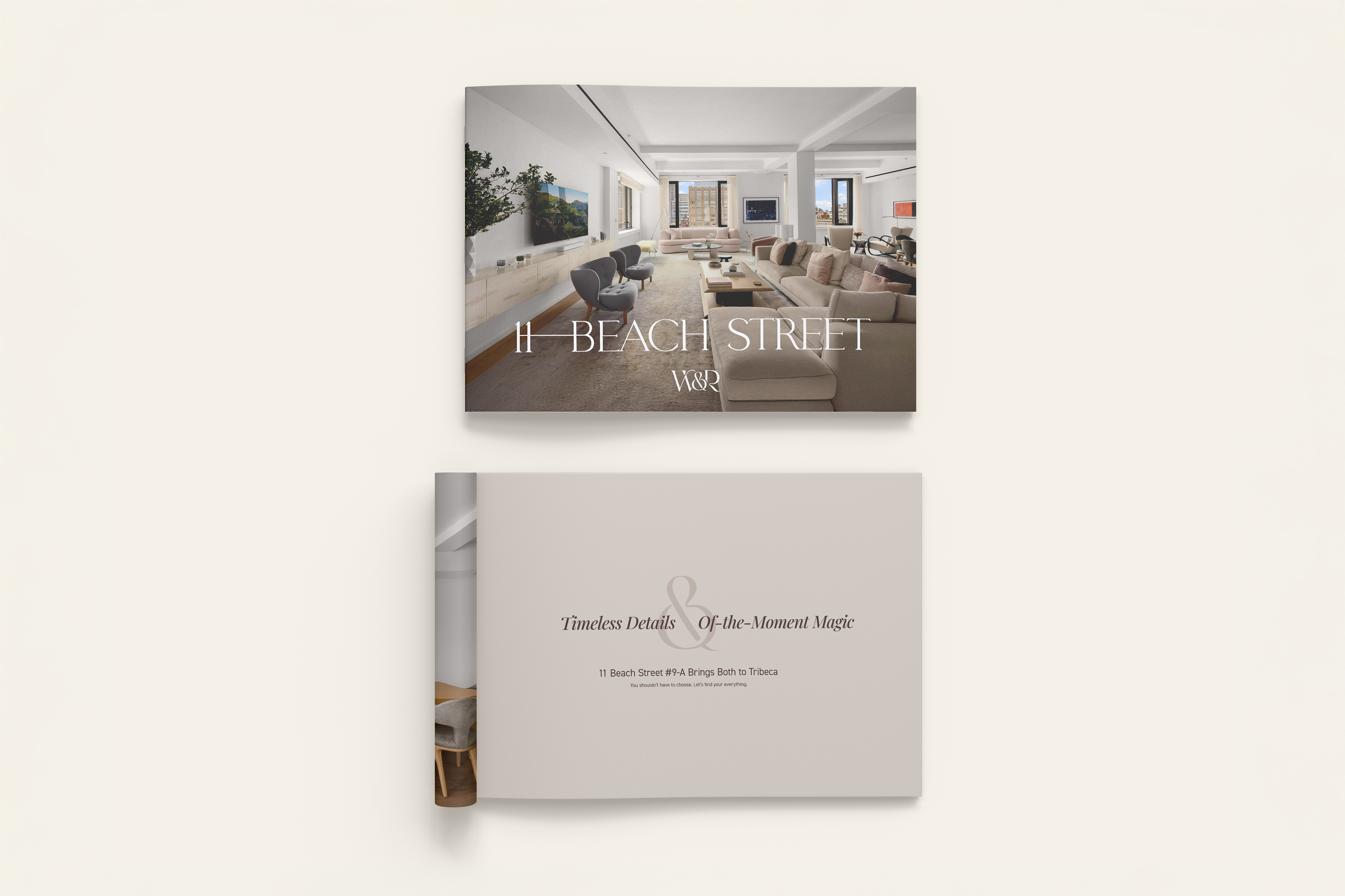
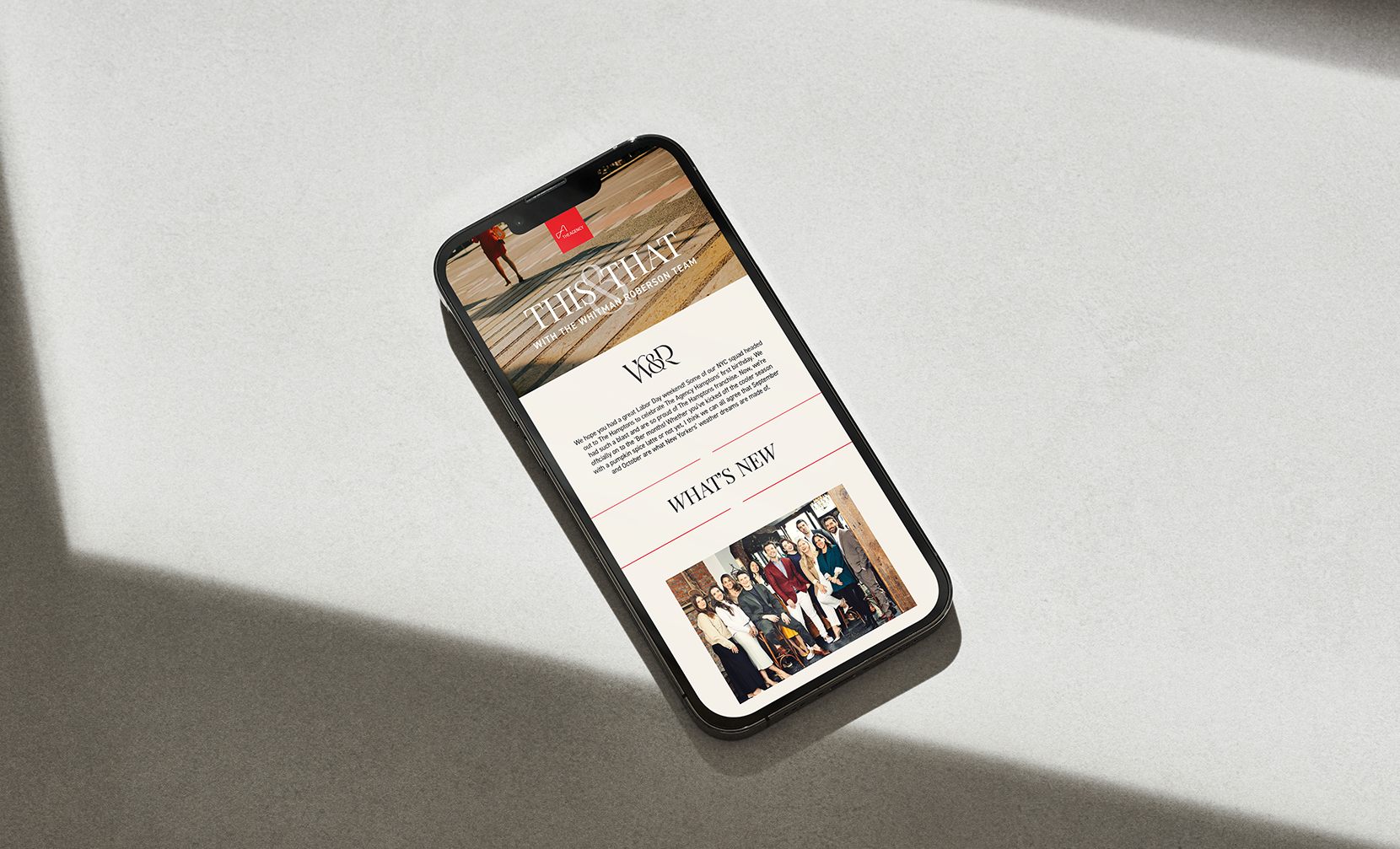
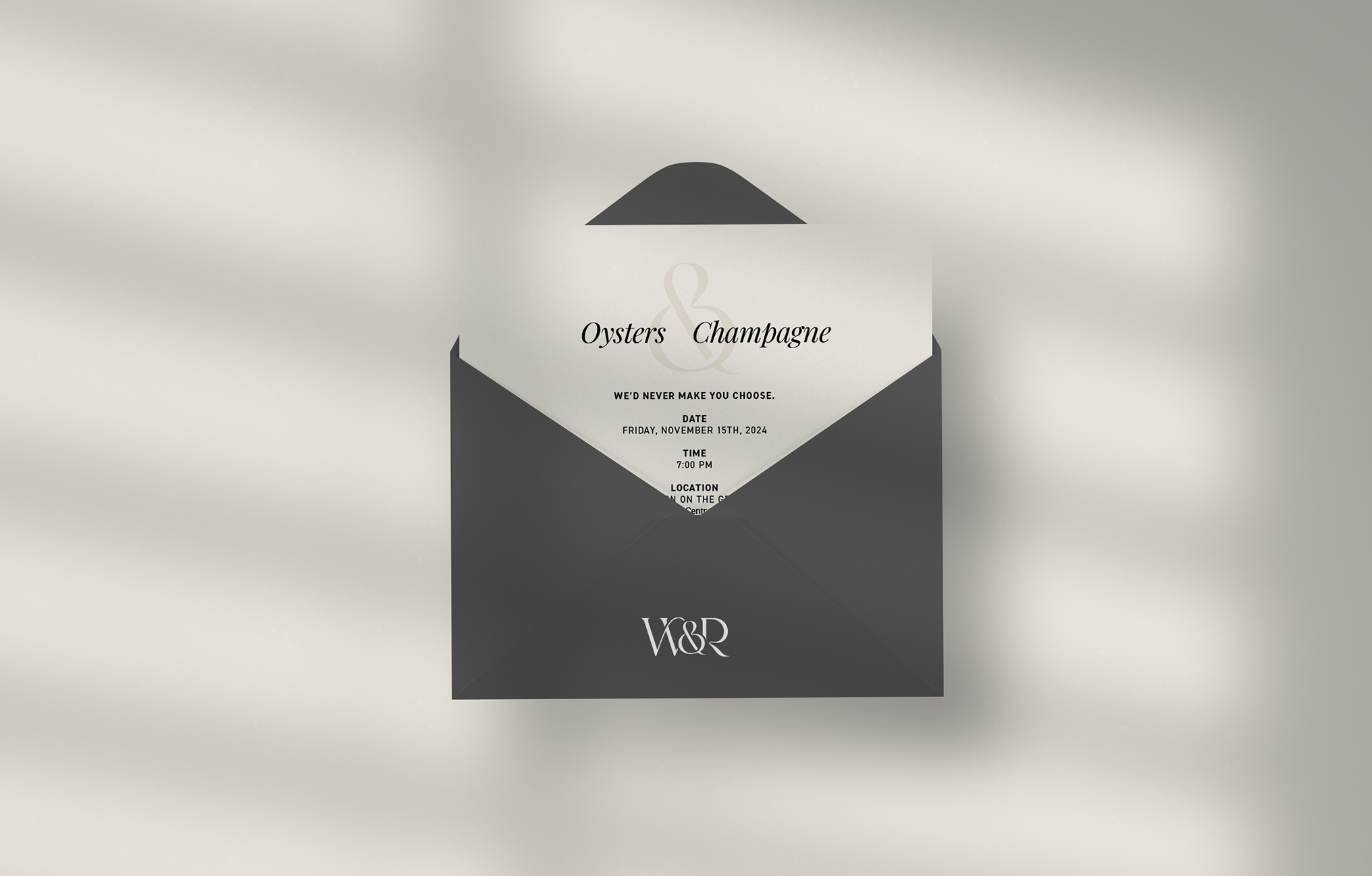
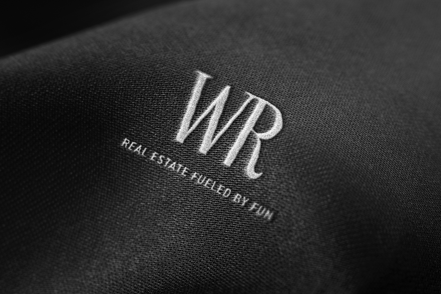
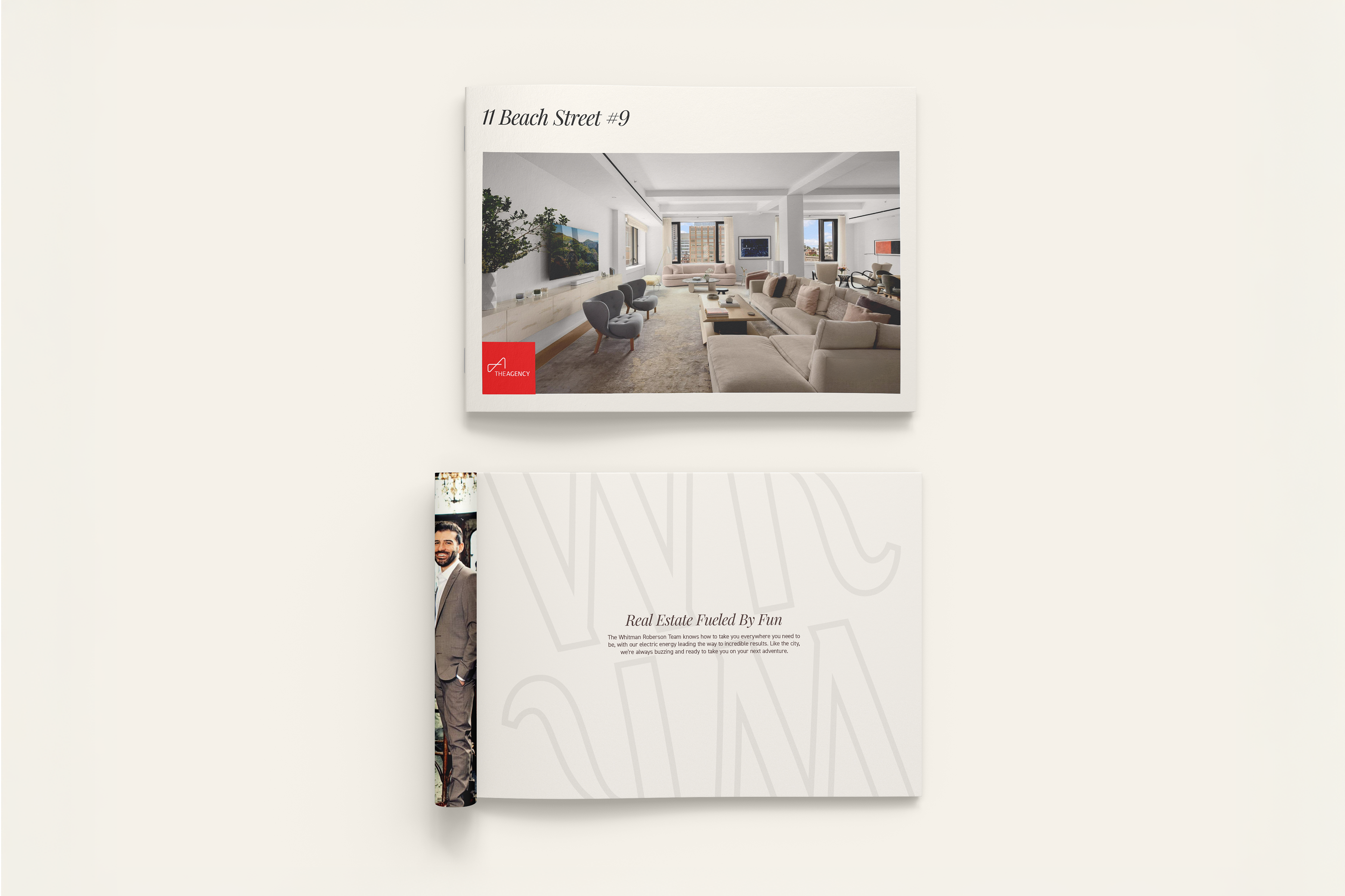
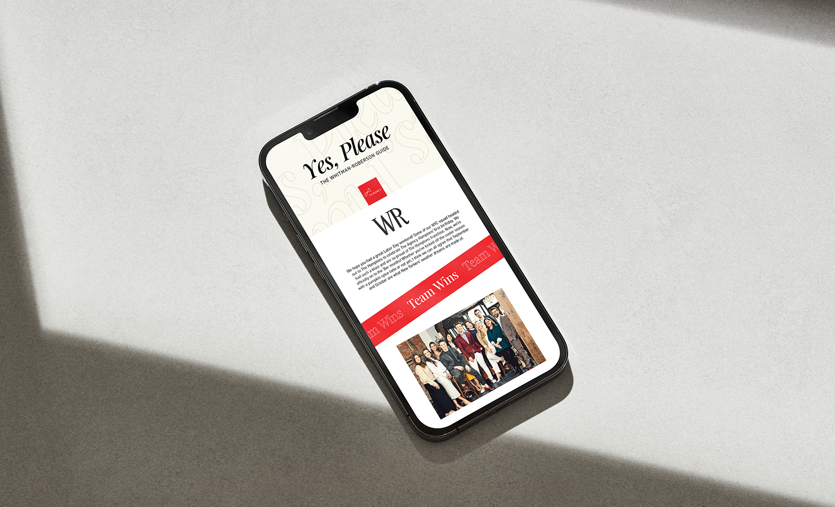
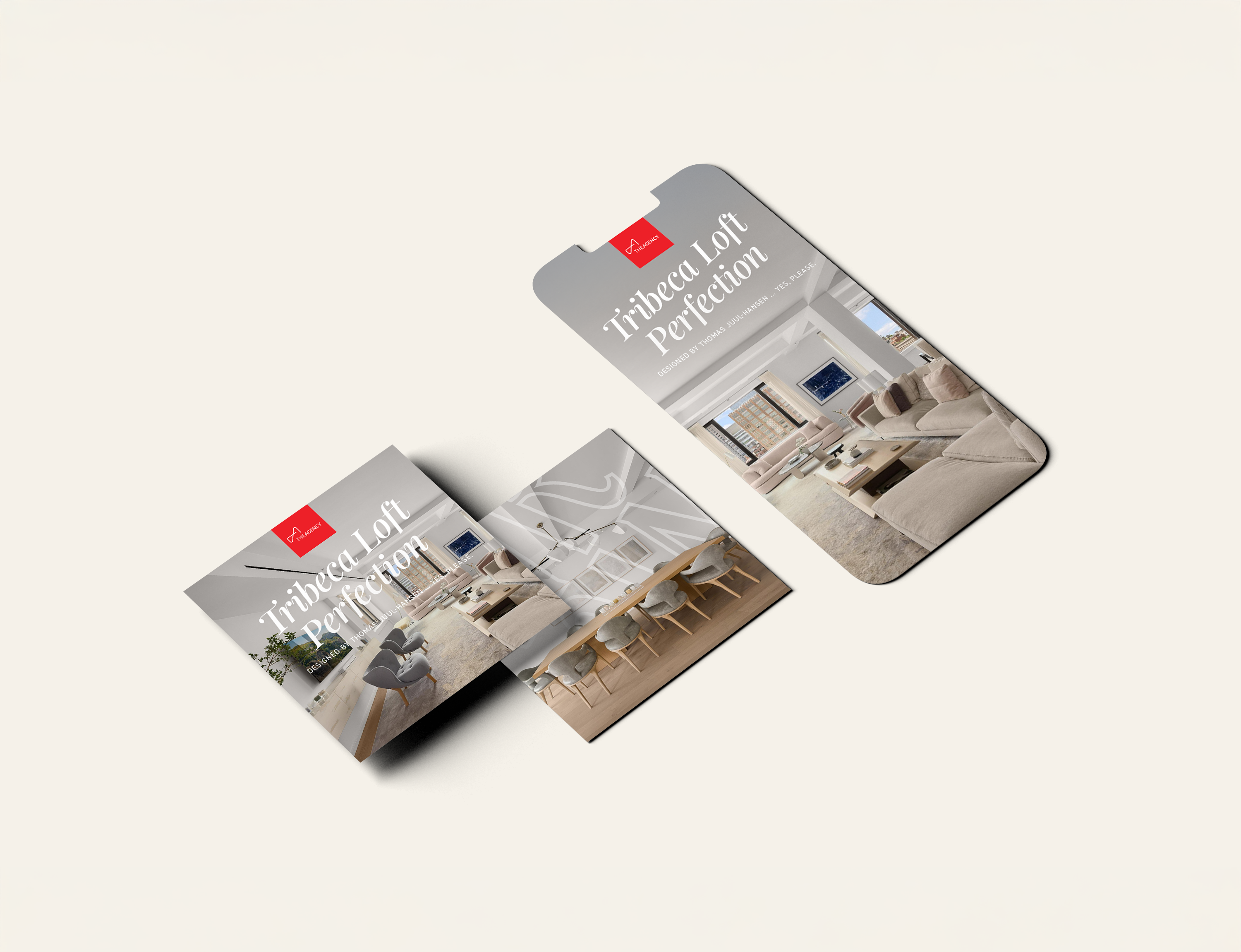

True to its name, “Bringing Both” brought everything together. Once the direction was set, we built a full suite of deliverables: logo, custom brochure, newsletter template, listing collateral, social banners, and more. The ampersand became the thread running through each piece. The final system stayed fresh and recognizable, with room to evolve—while staying firmly within The Agency’s brand guidelines.


Copywriter, Brand Strategist
Sarah Jensen-Mount
Marketing Account Manager
Meghan Marron
The team loved the result and put it to use right away. They rolled out the new logo immediately and updated their active listings with new visuals. Internally, the project became a point of pride. My creative director featured it in a leadership presentation as a standout example of the quality and range our team could deliver.
